Close Menu
Zero2Turbo
    Facebook X (Twitter) Instagram
    Facebook X (Twitter) Instagram RSS
    Zero2Turbo
    • Home
    • Contact
    • Videos
      Featured

      Pastrana Takes Gymkhana Down Under with Wild Subaru Brat in Aussie Shred

      By Zero2TurboDecember 9, 2025
      Recent

      Pastrana Takes Gymkhana Down Under with Wild Subaru Brat in Aussie Shred

      December 9, 2025

      Bentley Owners Can Design Their Own Animated Welcome Lamp

      November 20, 2025

      Limited Bentley Continental Supersports Revealed Packing 657 HP (490 kW)

      November 14, 2025
    • South Africa
    • Zero2Turbo Telegram
    Zero2Turbo
    Home»News»BMW and BMW M Get New Logos
    News

    BMW and BMW M Get New Logos

    By Zero2TurboMarch 4, 2020No Comments
    Facebook Email Twitter LinkedIn Telegram WhatsApp
    Share
    Facebook Email Twitter LinkedIn WhatsApp Telegram

    We spend our lives looking at mobile phone and computer screens so it makes sense that logos adopt a flat design ethos.

    Last year, Volkswagen revealed a new flatter modern logo and now it is BMW’s turn.

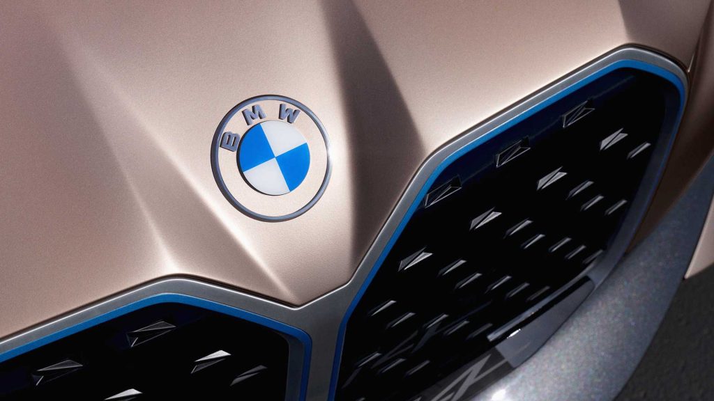
    BMW showed off the new logo on the i4 Concept and it is actually quite a big change. Gone is the iconic black ring that surrounded the blue-and-white pie inside. The ring is now transparent, letting the Frozen Light Copper of the concept shine through. Obviously this will change depending on the car’s exterior colour.

    The new logo is also flat, eschewing the old logo’s three-dimensional appearance, lighting effects, and shadows, though it’ll still look 3D on the vehicles.

    Jens Thiemer, Senior Vice President Customer & Brand BMW, said the black wring is gone because the new logo will “radiate more openness and clarity” with its now transparent design. The new logo should also catch the eye of younger buyers, too, who are well-versed in navigating a digital world.

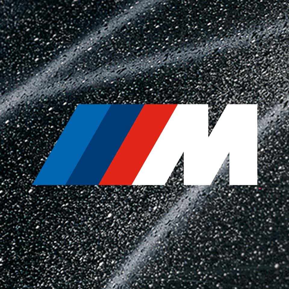
    Although nothing has been made official yet, it looks like the BMW M logo has taken a similar turn. Take a look at the official Facebook page and you will see a new logo which completely dismisses the familiar three-dimensionality badge (see below). The new iteration has a modern 2D look and four colours.

    The characteristic M logo does not shine with a chrome effect, instead, is kept in plain white. The three coloured stripes to the left of the M are also shown without any shades, gradients and other effects. Instead, they are kept completely monochrome.

    It remains to be seen whether the new two-dimensional BMW M logo will only be used for communication and presentation purposes or on actual vehicles.
    BMW
    Share. Facebook Email Twitter LinkedIn WhatsApp Telegram
    Previous ArticlePrior Design McLaren 720S Makes New 765LT Look Tame
    Next Article ‘Visceral’ Limited-Edition Aston Martin V12 Speedster Revealed

    Related Posts

    BMW Z4 Final Edition Marks the End of a 30-Year Era

    December 2, 2025

    BMW X3 20 Pure Design Added To South African Lineup

    November 6, 2025

    BMW M2 Turbo Design Edition Pays Tribute to the Iconic 2002 Turbo

    October 13, 2025

    BMW South Africa Revives Legends with 325iS and 333i Homage Editions

    October 9, 2025

    The BMW 8 Series, X4 and Z4 Are Getting Axed

    October 6, 2025

    Hydrogen-Powered BMW X5 Hitting Production in 2028

    September 23, 2025
    Popular Posts
    • Volkswagen Motorsport South Africa Reveal New GTC Car Based On Golf 8 GTI
    • Jaguar F-Type Coupe 3.0 Supercharged V6
    • Tesla Pickup (Bakkie) Will Be Quicker Than A Porsche 911
    • Ford Mustang-Inspired EV SUV To Have Impressive 600KM Range
    • BJ Baldwin’s Recoil 4 Is The Best Yet

    Facebook X (Twitter) Instagram YouTube RSS
    Designed by Zero2Turbo.

    Type above and press Enter to search. Press Esc to cancel.